Neon HTML/CSS Button & Control Kit
A downloadable asset pack
Build clear neon controls for browser game menus, HUDs, settings screens, websites, and app interfaces without a framework or package install.
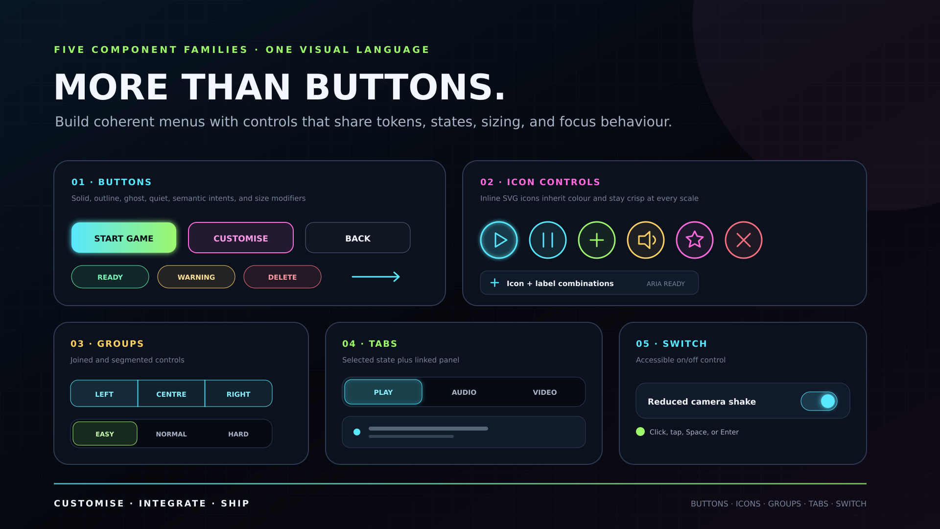
Version 2.0 is a full component-kit rebuild: use the CSS alone for visual buttons, or add the optional dependency-free JavaScript for working toggle buttons, segmented controls, switches, tabs, accent choices, and copy helpers.
What is included
- Interactive Component Gallery (
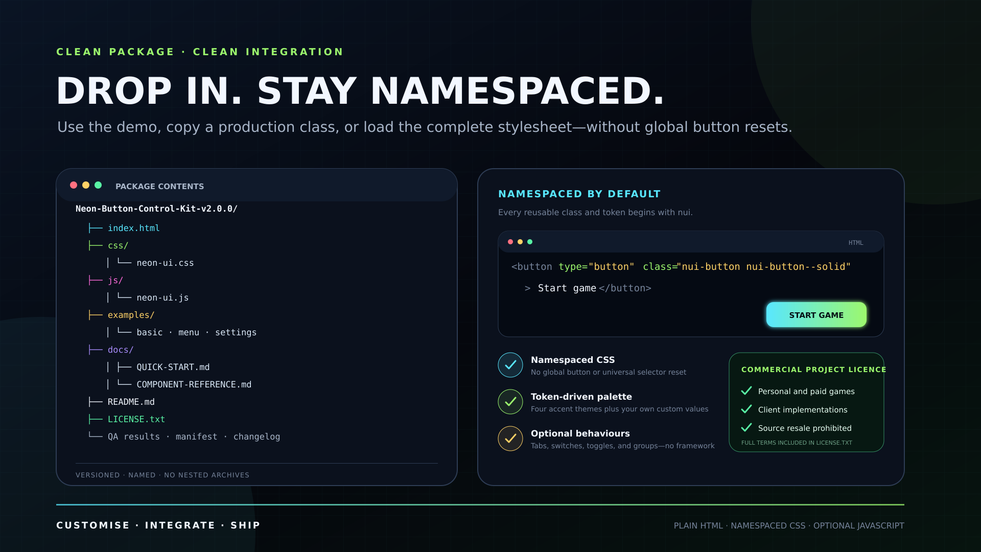
index.html) - Readable and minified component CSS
- Readable and minified optional JavaScript behaviours
- Separate gallery/example stylesheet
- Basic Buttons example
- Game Menu example
- Settings Panel example
- Quick start and customisation guides
- Complete component, event, accessibility, browser-target, and QA references
- Completed release results plus a dependency-free structural validator
- Plain-English commercial-use licence
Everything uses local files. There are no runtime packages, CDNs, remote fonts, or framework dependencies.
Button system
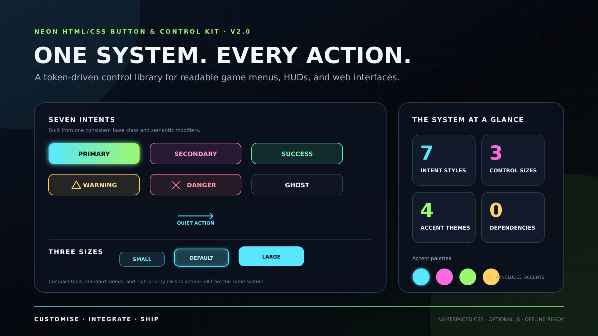
- Primary, secondary, success, warning, danger, ghost, and quiet intent styles
- Small, default, and large sizes
- Solid, pill, wide, and circular icon options
- Button groups and single-choice segmented controls
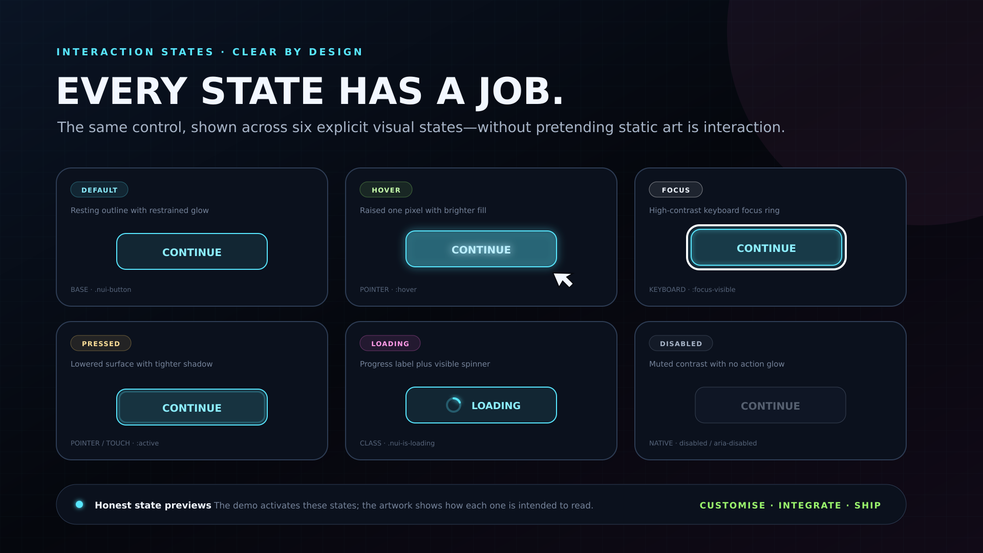
- Hover, active, visible-focus, pressed, loading, native-disabled, and ARIA-disabled states
- Inline SVG icon styling
- Cyan, magenta, lime, and amber accents
- Editable CSS custom properties for colours, surfaces, type, radii, sizing, and motion
Optional interactive controls
data-nui-toggleupdatesaria-pressedand emitsnui:togglewithdetail.presseddata-nui-segmentedanddata-nui-segmentprovide single-choice keyboard navigation and emitnui:changewithdetail.valuedata-nui-switchupdatesaria-checkedand emitsnui:changewithdetail.checkeddata-nui-tabsanddata-nui-tabmanage tab/panel state and emitnui:tabchangewithdetail.idanddetail.indexdata-nui-accent-choicepowers the optional accent preview preferencedata-nui-copyprovides a copy/select helper for code samples
The script initialises matching controls automatically when the document is ready. It does not add a framework or public global object.
Keyboard and accessibility-oriented states
The kit includes visible :focus-visible styling, native-button examples, Arrow/Home/End navigation for tabs and segmented controls, reduced-motion rules, forced-colour adjustments, ARIA state hooks, and labelled icon examples.
This is an implementation foundation, not an accessibility certification. Finished projects still need appropriate labels, content, colour checks, and testing.
Browser target
Targets modern Chrome, Edge, Firefox, and Safari. Exact tested browser versions and platforms are TBD pending final release QA and are recorded in the included browser-support document only after they are actually tested.
Licence summary
Use and modify the kit in personal or commercial finished websites, games, apps, and client projects. Attribution is not required.
Do not redistribute, sell, share, or sublicense the source files or components as a standalone UI kit, library, template, starter kit, or asset pack. See the included LICENSE.txt for the full terms.
Purchase
In order to download this asset pack you must purchase it at or above the minimum price of $1.99 USD. You will get access to the following files:
Leave a comment
Log in with itch.io to leave a comment.